Use a mix of formats, not one. Most client engagements run well on four pillars: an executive PDF for decision makers, a live dashboard for anyone who wants on demand numbers, a slide deck for the review meeting, and an editable spreadsheet export for whoever needs to dig into the raw figures. Skip any one of these and someone on the client side ends up chasing you for information they should already have.
Here’s how that mix typically maps to who needs what:
- Executives and budget holders want a short PDF or executive summary, monthly or quarterly, with the headline numbers and a recommendation.
- Delivery teams and project leads work best from a live dashboard or weekly status update, updated continuously or sent weekly.
- Campaign owners and marketing contacts need weekly summaries plus dashboard access for the days between reports.
- Finance contacts need monthly budget and variance reports, usually in spreadsheet form so they can check the arithmetic.
- Data or analyst teams want raw exports in Excel or Google Sheets, not a polished summary they can’t manipulate.
One format never covers every reader. A dashboard gives transparency but no narrative; a PDF gives narrative but goes stale the day after you send it. Mixing formats means every stakeholder gets information in the shape they’ll actually use, which is the whole point of reporting in the first place.
Key Takeaways
Effective client reporting combines multiple formats, an executive PDF, a live dashboard, a slide deck and an editable spreadsheet, each matched to a specific audience and cadence.
| Point | Details |
|---|---|
| Mix formats, don’t pick one | Combine PDF, dashboard, slide deck and spreadsheet so every stakeholder gets data in a usable shape. |
| Match cadence to audience | Executives need monthly or quarterly summaries; delivery teams need weekly or live updates. |
| Include five core components | Executive summary, comparative metrics, proof of work, honest analysis and next steps belong in every report. |
| Automate the data layer, not the honesty | Feed one governed data source into multiple outputs, but keep the analysis section written by a person. |
| Cloud 9 unifies the reporting pipeline | Cloud 9 connects CRM, analytics and finance data into one source feeding dashboards, PDFs and exports automatically. |
Table of Contents
- Types of client reporting formats every professional should know
- When to use each format: audience, cadence and delivery
- Five things every high-performing client report needs
- How to pick the right format for a specific client
- Templates and reusable report blocks you can copy
- Tools and automation options for client reporting
- Best practices and common mistakes in client reporting formats
- Customisation strategies for different industries or project types
- Handling confidential or sensitive information in reports
- What good reporting actually looks like in practice
- How Cloud 9 handles reporting automation for you
- Sources
- FAQ
Types of client reporting formats every professional should know
There’s a fairly settled list of report types that shows up across agencies, consultancies and project teams, and a widely cited breakdown groups them into project status, progress, performance, financial, timesheet, compliance, variance, procurement and executive summary reports. Knowing the full set matters because most reporting failures come from using the wrong type for the moment, not from bad data.
-
Project or status report. A snapshot of where a project stands right now: tasks complete, tasks in progress, blockers. Project managers and clients tracking delivery need this weekly or fortnightly. A one-line version: “On track, two tasks delayed by supplier lead time, revised date attached.” Export as a PDF or a shared dashboard view.
-
Progress report. Similar to a status report but framed around milestones over a longer arc, useful for multi-month engagements. Send monthly. Best delivered as a short PDF with a simple progress bar or percentage complete against the original plan.
-
Performance or KPI report. The core of ongoing service reporting: how key metrics moved against target, and why. Marketing and account leads need this monthly, sometimes weekly during a campaign push. A slide deck or dashboard both work, depending on whether it accompanies a live meeting.
-
Financial report. Covers spend, revenue impact or cost savings tied to the work. Finance stakeholders and budget owners need this monthly. Spreadsheet export is usually non-negotiable here because someone will want to check the totals themselves.
-
Budget and variance report. Compares planned spend against actual spend and explains the gap. Send monthly or whenever a variance crosses an agreed threshold. Excel or Google Sheets, always, because variance analysis is a numbers exercise, not a narrative one.
-
Timesheet report. Hours logged against tasks or retainer allowances. Operations contacts and anyone managing a retainer need this monthly. A spreadsheet export straight from your time tracking tool usually does the job with no extra formatting required.
-
Compliance or incident report. Documents an issue, its cause, and the resolution. Sent ad hoc, the moment something happens, never batched into a monthly cycle. A structured PDF works best because it needs to stand alone as a record.
-
Procurement or summary report. Tracks vendor spend, contract status or supplier performance. Useful quarterly for clients managing multiple suppliers. Spreadsheet or a short summary PDF, depending on complexity.
-
Executive summary report. The condensed version of everything above, built for someone with ninety seconds to spare. Executives and board level contacts need this monthly or quarterly. Micro-template: “Revenue up 12% against target, driven by X; one delayed workstream needs a decision on Y this month.”
-
KPI dashboard or live report. Not a document at all, but a continuously updated view, usually built in Power BI or a similar tool, connected to the underlying data. Anyone who wants numbers on demand rather than waiting for the next scheduled send benefits from this. It’s the format that removes the “can you send me an update” email entirely.
Grouping these into five broader categories, overview, workstream, campaign or project, dashboard, and executive summary, can help if you’re building a template library and don’t want ten separate formats to maintain. Pick the granularity that matches how complex your engagements actually are.
When to use each format: audience, cadence and delivery
Matching format to audience is mostly about respecting how much time someone has and how much control they need over the data.
- Executives: monthly or quarterly PDF, short, decision focused, no raw data tables.
- Campaign or account owners: weekly summary email plus standing dashboard access for anything urgent between sends.
- Finance: monthly budget and variance report in Excel or Google Sheets, because they’ll want to recalculate something eventually.
- Delivery or technical teams: live dashboard updated continuously, supplemented by a brief written note when something changes materially.
- Boards or steering committees: quarterly executive summary, often paired with a short slide deck for the meeting itself.
Delivery method matters as much as the format. Reporting output can reach clients as a dashboard link, a PDF by email, a slide deck presented live, or a spreadsheet shared for analysis, and each has a trade off:
- PDF by email: easy to archive and forward, but static the moment it’s sent.
- Live dashboard link: always current, but offers no narrative unless you add commentary alongside it.
- Slide deck in a meeting: forces discussion and decisions, but only works if the meeting actually happens.
- Editable spreadsheet: lets analysts manipulate the data directly, but isn’t suitable for anyone who just wants the headline.
- Client portal access: gives a single place for everything, useful once a relationship matures past ad hoc reporting.
Ad hoc reporting sits outside the normal schedule and should trigger immediately, not wait for the next cycle. A security incident, a missed deadline that affects a client deliverable, or a budget overrun crossing an agreed threshold all count as immediate update triggers. Waiting until the next scheduled report to mention any of these is how trust erodes.
Five things every high-performing client report needs
Most reports fail not because the data is wrong but because they’re missing one of five components. Build a checklist around these and you’ll rarely get a client asking “so what does this actually mean for us.”
- An executive summary. Two to four sentences, written last, covering the single most important event, the key metric, and what needs a decision next.
- Performance metrics with comparison. Numbers on their own tell you nothing. Show this period against last period, and against the target, every single time.
- Proof of work completed. A short list of what actually got delivered, not a wall of task tickets. Clients want evidence the work happened, not a project management export.
- Honest analysis of what isn’t working. The section most reports skip entirely. Naming an underperforming channel or a delayed workstream, with a reason, builds more credibility than a report full of green ticks.
- Clear next steps. Specific actions with an owner and a date, not “continue monitoring.”
Here’s a copyable executive summary block:
Pro Tip: Parameterise your templates rather than rewriting them from scratch each cycle. Set fixed slots for the headline metric, the KPI thresholds that trigger a flagged colour, and one narrative block that changes each period. This is how you keep every report feeling written for that specific client without spending three hours per report doing it.
Reporting that explains why a metric moved, not just that it moved, tends to keep clients renewing rather than shopping around, because it shows the work being tracked has a coherent story behind it rather than a spreadsheet nobody reads properly.
How to pick the right format for a specific client
Choosing a format isn’t guesswork if you ask the right questions early. A few decision rules cut most of the ambiguity:
- Match the stakeholder’s stated preference first. If someone tells you during onboarding they only ever open PDFs, building them a dashboard is wasted effort no matter how good it looks.
- Optimise for decision readiness, not completeness. A report that buries the one decision a client needs to make inside twelve pages of charts has failed, even if every chart is accurate.
- Weigh editing needs against frequency. If a client’s finance team needs to manipulate figures, give them a spreadsheet. If nobody ever touches the raw numbers, a PDF is lighter to produce and easier to read.
A short choice flow that works during onboarding or a new engagement: ask how the client prefers to consume information, ask who on their side needs raw data access versus a summary, then build the smallest set of formats that satisfies both answers without duplicating effort. Capturing these preferences properly during onboarding avoids the awkward month three conversation where a client admits they’ve never opened the PDF you’ve been sending.
Always ask directly about file type and data access needs rather than assuming. Executives tend to want a polished PDF; data teams tend to want raw exports in Excel or Google Sheets, and guessing wrong in either direction wastes a reporting cycle finding out.
Templates and reusable report blocks you can copy
Having a skeleton ready saves the blank page problem every single cycle. A few blocks worth keeping on file:
- Executive summary skeleton: “[Metric] moved [up/down] [amount] against [target/period], driven by [cause]. [Workstream] needs [decision] by [date].”
- KPI table skeleton: Metric | This period | Last period | Target | Trend. Four columns is usually enough; more than six and nobody scans it properly.
- One-line analysis examples: “Conversion dipped due to a checkout bug fixed on the 9th” reads far better than “conversion decreased 3%” with no context attached.
A slide deck for a client review meeting rarely needs more than five or six slides:
- Headline summary — the one thing the client needs to remember from this meeting.
- Performance against target — the core KPI table or chart.
- Work completed this period — a short, specific list.
- What isn’t working and why — the honesty slide.
- Recommendations and decisions needed — the action slide.
- Next period focus — what changes going forward.
Email matters more than most reporting guides admit.
Tools and automation options for client reporting
Live dashboards, spreadsheet exports and scheduled documents each solve a different problem, and the tool choice should follow the format, not the other way round.
- Live dashboards: Power BI or Looker Studio both connect to multiple data sources and update continuously, which suits any stakeholder who wants numbers on demand rather than waiting for a scheduled send.
- Spreadsheet exports: Google Sheets or Excel remain the default for anyone who needs to manipulate figures rather than just read them.
- Scheduled PDFs and slide exports: most dashboard tools can export a static snapshot on a schedule, which covers executives who want the polish of a document without anyone manually rebuilding it each month.
- Marketing data feeds: Google Analytics’ reporting APIs commonly feed the dashboards and scheduled exports behind marketing performance reports.
The real time saving comes from building one governed data layer that feeds every output, rather than manually re-entering the same figures into a PDF, a spreadsheet and a slide deck separately. The stronger operational pattern for 2026 is running live dashboards and scheduled narrative reports from the same underlying connection, so the numbers never drift between formats. Use dashboards for transparency and PDFs for decisions; trying to make one format do both jobs is usually where reporting stops working.
Best practices and common mistakes in client reporting formats
The gap between a report clients trust and one they skim past usually comes down to a handful of habits.
Do:
- Lead with results and the decision the client needs to make.
- Keep one headline metric per chart, with axes and the time period clearly labelled.
- Flag what isn’t working before the client has to ask.
Don’t:
- Open with a list of activities completed instead of outcomes achieved.
- Cram five metrics onto one chart until nobody can read it at a glance.
- Reuse inconsistent naming for the same metric across different reports.
The most common operational mistakes are simple to fix once you see them: work sprawl from rebuilding the same figures across three tools, inconsistent metric naming that makes month on month comparison confusing, and missing action items that leave clients unsure what happens next. A shared template with fixed metric names and a mandatory “next steps” section solves most of this without any new software.
Customisation strategies for different industries or project types
A retail client tracking seasonal campaigns needs different formatting rhythm to a professional services firm billing hourly against a retainer. Ecommerce and marketing clients generally respond best to weekly dashboards with revenue, conversion and spend front and centre, because their metrics move fast and stale data loses value within days.

Membership organisations and professional firms, by contrast, tend to care more about engagement trends, renewal rates and compliance milestones, which suit a monthly or quarterly cadence with more narrative and less real time noise. Construction or long cycle project work leans towards milestone based progress reports rather than KPI dashboards, since the metrics that matter (percentage complete, budget variance) shift on a project timeline, not a weekly one.
The safest customisation rule is to keep your underlying template structure identical across industries, executive summary, metrics, work completed, analysis, next steps, and only swap the specific KPIs and cadence to match the sector. That way you’re not maintaining ten unrelated template families, just ten sets of parameters feeding the same skeleton.
Handling confidential or sensitive information in reports
Client reports routinely contain information that shouldn’t travel further than the intended recipient: pricing, internal performance issues, security incidents, or personal data tied to compliance obligations. The starting rule is simple: match the distribution method to the sensitivity of the content, not to convenience.
A live dashboard shared via a public link is a liability if it contains financial detail meant only for one contact; restrict access by login rather than relying on an unlisted URL. PDFs containing sensitive figures should go through secure email or a client portal rather than a general shared drive, and anything involving personal data should follow your organisation’s data protection obligations before it ever reaches a report template. Compliance and incident reports in particular deserve tighter distribution than routine status updates, since they often document exactly the kind of issue a client wouldn’t want circulating internally beyond the people who need to act on it. When in doubt, ask the client who specifically should receive a given report, rather than defaulting to a wide distribution list built for convenience.
What good reporting actually looks like in practice
Most reporting advice focuses on templates, but the harder problem is discipline: sending the same structure consistently even when the numbers are bad. Reports that only appear polished when performance is good train clients to distrust the quiet months.
The formats matter less than most people think. A PDF, a dashboard, a spreadsheet, none of them fix a report that avoids naming what went wrong… Standardised formats work because they force consistency, but the honesty in the analysis section is what actually keeps a client renewing…
How Cloud 9 handles reporting automation for you
Building and maintaining separate tools for dashboards, spreadsheets and scheduled PDFs is exactly the kind of fragmented setup Cloud 9 exists to remove. Rather than juggling one supplier for your CRM data, another for your analytics, and a spreadsheet someone updates manually every month, Cloud 9 connects your systems into a single governed data layer that feeds every report format automatically.
That means your executive PDF, your live dashboard and your client’s spreadsheet export all pull from the same numbers, updated once rather than three times. Cloud 9’s ecommerce reporting and analytics automation work is built for exactly this problem: established businesses spending hours each month reassembling figures that should already be connected. If you’re managing multiple client accounts or internal stakeholders and the manual reporting workload is starting to show, get in touch with Cloud 9 to see what a properly integrated data layer could look like for your reporting cycle.
Sources
- Client Reporting: 10 Types of Client Reports (Templates Included)
- Client reporting: what to include and how to do it
- Client Reporting for Agencies 2026: Complete Guide
- Google Analytics developer documentation
FAQ
What are the four main types of reports?
The four most commonly cited categories are status reports, progress reports, performance or KPI reports, and financial reports, though most professionals also rely on executive summaries and dashboards alongside them.
What are the different types of reporting styles?
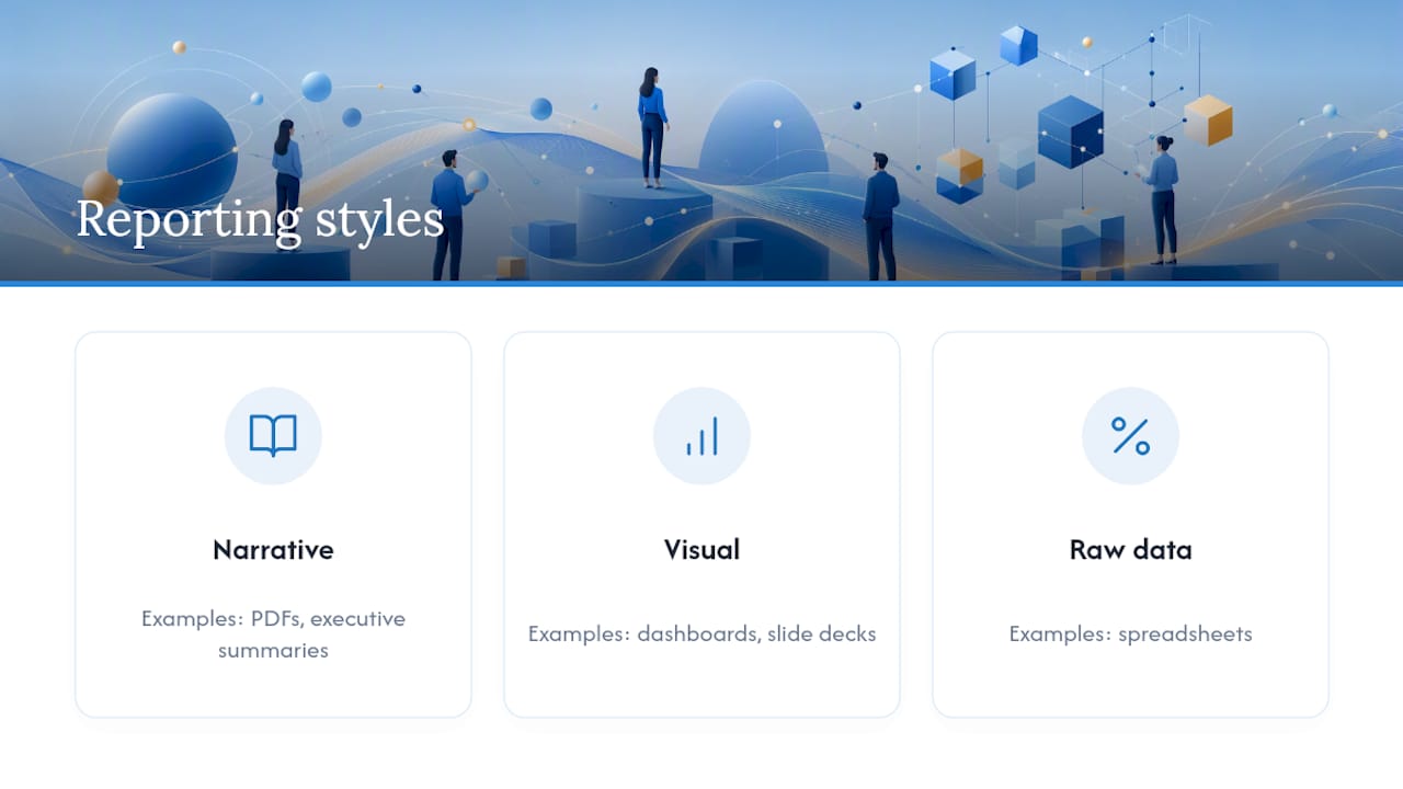
Reporting styles range from narrative documents like PDFs and executive summaries, to visual formats like dashboards and slide decks, to raw data formats like spreadsheets, each suited to a different reading habit.
What are the five types of reports?
A common five category grouping covers overview or executive reports, workstream reports, campaign or project reports, KPI dashboards, and executive summaries, grouped this way to match distinct stakeholder needs.
What are the three different types of reporting?
At the simplest level, reporting splits into status reporting (what’s happening now), performance reporting (how metrics are tracking against target), and financial reporting (spend and budget position).
How often should I send client reports?
Cadence depends on the stakeholder: executives typically want monthly or quarterly summaries, campaign owners want weekly updates, and finance contacts need monthly budget and variance reports.
Can Cloud 9 help automate multiple report formats at once?
Cloud 9 builds a single connected data layer that feeds dashboards, PDF exports and spreadsheets simultaneously, which removes the manual work of updating each format separately.