Every website needs a mix of these menu types: horizontal top navigation for primary links, dropdowns or mega menus for hierarchy, sidebar navigation for deep content, hamburger or off-canvas menus for mobile, plus footer links, breadcrumbs, and search as supporting cast. Horizontal bars suit small, predictable sites. Mega menus handle large catalogues. Sidebars fit documentation and dashboards. Hamburger menus solve mobile space but hide options, so pair them with a bottom bar when task speed matters. Breadcrumbs and anchor links add context inside long or nested content. Search takes over where menu depth would otherwise overwhelm.
The sections below cover characteristics, accessibility requirements under WCAG 2.1, mobile behaviour, and real implementation examples for each pattern, so you can match structure to content volume rather than guessing.
Key Takeaways
Navigation works when menu type matches content volume and hierarchy depth, not when it follows whatever pattern looks fashionable that year.
| Point | Details |
|---|---|
| Match pattern to volume | Use horizontal nav for small sites, mega menus once categories exceed roughly eight items. |
| Clicks matter less than clarity | Predictable, honestly labelled paths beat shorter paths with vague labels, per NN/g’s research. |
| Mobile needs its own plan | With mobile making up about 44% of traffic, test hamburger versus bottom-bar patterns directly on device. |
| Accessibility is not optional | Build focus order, skip links, and keyboard support against WCAG 2.1 from the start, not after launch. |
| Audit before you rebuild | Cloud 9 runs navigation and IA audits as part of its web design service, ahead of any full redesign. |
Table of Contents
- What are the main types of website navigation menus?
- Dropdown menus and flyouts explained
- Mega menus for large catalogues
- Sidebar and vertical navigation
- Hamburger and off-canvas menus for mobile
- Footer navigation and sitemaps
- Breadcrumbs and in-page anchor navigation
- Search and utility navigation
- Getting the hierarchy right: information architecture for navigation
- Cloud 9’s checklist for accessible, mobile-first navigation
- A practitioner’s view on choosing navigation patterns
- Get your navigation audited properly
- Sources
- FAQ
What are the main types of website navigation menus?
Horizontal top navigation is the default for a reason: logo on the left, four to seven primary links across the middle, a utility area (search, account, cart) on the right. It fits small-to-medium sites with a stable, predictable set of top-level sections.
A sticky variant keeps that bar visible as users scroll, trading a strip of screen real estate for constant access to search or checkout. On content-heavy pages that trade-off often backfires: a sticky header eating 80 pixels on a mobile screen can shove the actual content below the fold.
- Composition: logo, 5-7 primary links, secondary utility icons
- Best fit: brochure sites, SaaS marketing pages, small ecommerce stores
- Sticky pros: persistent access to navigation and calls to action
- Sticky cons: reduces visible content area, especially on shorter screens
- Accessibility: logical focus order and a working skip-to-content link so keyboard users bypass the full link list
Pro Tip: Test your sticky header on a real mid-range Android phone, not just a simulator. Address bars and browser chrome eat vertical space differently across devices, and what looks fine in Chrome DevTools can crush your hero content on an actual handset.
Dropdown menus and flyouts explained
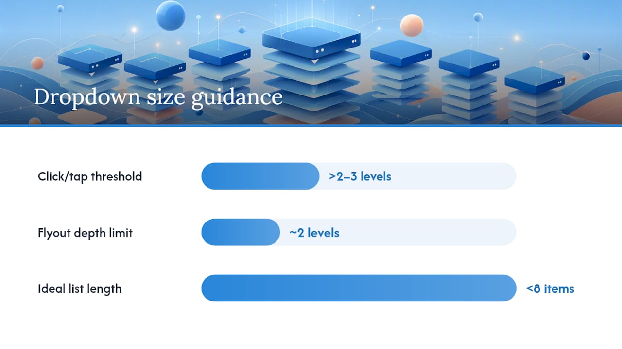
A dropdown exposes one extra level of hierarchy beneath a top-level link, and how you trigger it matters more than most teams assume. Hover-reveal works on a desktop with a mouse; it fails outright on touch devices, where there is no “hover” state, only tap. That mismatch is why so many mobile dropdown menus feel broken on first use.
Click or tap-to-reveal is the safer default across devices, particularly for menus with more than two or three child links. Flyouts (dropdowns that cascade sideways into a third level) work for structured category trees but get confusing fast beyond two levels deep.
- Use hover-reveal only where a mouse is guaranteed (internal tools, kiosk displays)
- Default to click/tap-reveal for anything public-facing
- Keep dropdown lists short, ideally under eight items, or switch to a mega menu
- Manage keyboard focus and use visible focus styles, not colour alone, to show selection
- Test with an actual screen reader, since ARIA attributes alone don’t guarantee accessible behaviour
When a dropdown’s contents aren’t easily guessable from the parent label, discoverability suffers regardless of interaction model. That’s usually a labelling problem, not a technical one, and it’s worth fixing the label before you fix the code.
Mega menus for large catalogues
A mega menu replaces a narrow dropdown list with a wide panel of columns, often grouped by category, sometimes carrying thumbnails or promotional tiles. Retail sites with hundreds of product categories rely on them because a single-column dropdown of 40 items is unusable, while six columns of eight related items is scannable.
Webflow’s guidance on navigation bar design makes the case for progressive disclosure inside these panels: group by function or audience rather than dumping every subcategory flat, and cap the visible columns so the panel doesn’t stretch beyond the viewport.
- Column count: three to six tends to stay legible; beyond that, users skim rather than read
- Group by user intent (by room, by activity, by department) rather than internal taxonomy
- Avoid decorative imagery that pushes text links further down the panel
- On mobile, collapse mega menus into stacked accordions rather than trying to shrink the grid
Pro Tip: If your mega menu needs a scrollbar to see all its columns, it’s not a mega menu anymore, it’s a sitemap wearing a hover trigger. Cut categories or split the panel into a proper landing page instead.
Sidebar and vertical navigation
Vertical navigation earns its place in documentation sites, admin dashboards, and web apps with deep, nested structures that a horizontal bar simply can’t hold. Docs sites in particular benefit because the sidebar can stay visible while the main content scrolls, keeping the reader’s place in a large table of contents constantly in view.
Persistent sidebars work when screen space allows it; collapsible sidebars (a toggle that slides the panel in and out) suit narrower viewports or dense applications where users need the content area back most of the time.
- Best fit: knowledge bases, SaaS dashboards, multi-level documentation
- Persistent sidebars suit wide desktop layouts with room to spare
- Collapsible sidebars suit dense apps or tablet-width viewports
- Use indentation and weight, not colour alone, to show nesting depth
- On small screens, fold the sidebar into a top nav or an off-canvas panel rather than stacking it above the content
Label clarity matters more in a sidebar than almost anywhere else, since users scan a long vertical list far faster than they read it. A vague label like “Resources” sitting between “Billing” and “API Keys” will get skipped simply because it doesn’t preview its content.
Hamburger and off-canvas menus for mobile

The hamburger icon solves a genuine space problem: on a 375-pixel-wide screen, there’s rarely room for six labelled links. But hiding your entire navigation behind three lines carries a real discoverability cost. Some users never tap it, particularly ones unfamiliar with the convention, and every hidden item is one users have to remember exists.
Awwwards’ navigation showcase reinforces a pattern worth copying: a visible, condensed primary nav or a bottom navigation bar often beats a fully hidden hamburger for task completion, because the most-used links stay one tap away instead of two. Reserve the hamburger for secondary links and long tail categories, and surface your top three or four destinations directly.
- Touch targets should sit around 44 by 44 pixels minimum to avoid mis-taps
- Keep the open/close animation under 300 milliseconds so it feels responsive, not sluggish
- Use
aria-expandedandaria-label="Menu"so screen readers announce the toggle’s state correctly - Consider a bottom tab bar for apps where four or fewer destinations dominate usage
- Test your off-canvas panel with the on-screen keyboard open, a common failure point on forms
Mobile now accounts for roughly 44% of global website traffic, which makes this decision far from cosmetic. Get it wrong and you’re degrading the experience for close to half your visitors.
Footer navigation and sitemaps
The footer is where navigation goes to catch what the top nav couldn’t fit: legal pages, contact details, careers, social links, and a scatter of deep links to popular subpages. It’s genuinely useful as a fallback, and genuinely useless when treated as a dumping ground for every page on the site.
A human-readable sitemap page, distinct from the XML sitemap search engines crawl, earns its place on very large sites where users occasionally need to see the entire structure at a glance, think large universities, government portals, or sprawling documentation hubs. Most small-to-medium sites don’t need one; the footer plus search covers the same job.
- Include: privacy policy, terms, contact, sitemap link, key category shortcuts
- Avoid: replicating the entire primary nav out of indecision about what’s “important”
- Add an HTML sitemap page only when the site has genuinely deep or sprawling structure
- Footers double as a soft SEO signal by surfacing internal links search engines might otherwise take longer to discover, but they shouldn’t substitute for clean site architecture
Breadcrumbs and in-page anchor navigation
Breadcrumbs answer one question instantly: where am I, and how do I get back up a level? They matter most on sites with genuine hierarchy, three or more levels deep, where a user landing on a subcategory page via search has no other clue how it relates to the wider structure. On a flat site with two levels total, breadcrumbs are just clutter.
Anchor links solve a different problem entirely: jumping within a single long page rather than between pages. A 3,000-word guide with a jump-to-section list at the top saves readers from scrolling blind, and it’s one of the simplest usability wins available on long-form content.
- Add breadcrumbs when the URL structure has three or more meaningful levels
- Skip breadcrumbs on flat sites, they add visual noise with no navigational value
- Use anchor links on documentation, long guides, and FAQ pages with five or more sections
- Mark up breadcrumbs with
<nav aria-label="Breadcrumb">and an ordered list for correct screen reader announcement - Anchor targets need visible focus styling so keyboard users can confirm they’ve landed correctly
Search and utility navigation
On a large site, search stops being a nice extra and becomes the primary way people find anything. If your catalogue or content library runs into the hundreds of items, no menu structure, however well organised, beats a search box with decent autosuggest.
Utility navigation, login, cart, language switcher, accessibility controls, sits apart from primary navigation because it serves a different job: account and preference tasks rather than content discovery. Keep these visually distinct from your main links so users don’t confuse “log in” with a content category.
- Autosuggest should surface actual page titles and product names, not generic categories
- Index your search properly; a search box returning irrelevant results erodes trust in the whole site
- Group utility links (account, cart, locale) in a consistent, small cluster, usually top right
- When your catalogue exceeds roughly 200 items, consider promoting search above deep category browsing entirely
Getting the hierarchy right: information architecture for navigation
Every menu type above depends on the same underlying discipline: information architecture. Get the hierarchy wrong and even the best-executed mega menu will feel confusing, because the problem sits one layer beneath the visual design.
Nielsen Norman Group’s research on navigation usefulness makes a point worth repeating to anyone still obsessing over the old “three clicks to anything” rule: click count matters far less than predictability. A five-click path where every step confirms you’re heading the right way beats a two-click path where users guess and often guess wrong. What NN/g calls “information scent” (whether a label accurately previews what’s behind it) is the real driver of findability, not the click tally.
Four practical rules follow from that:
- Write labels that preview content honestly. A link called “Solutions” that leads to a pricing page will frustrate users who expected a product overview; call it what it is.
- Limit top-level choices. Seven or fewer primary items is a reasonable ceiling for most sites; beyond that, users start scanning rather than reading, and decision quality drops.
- Group related items under a shared parent rather than scattering them across the top bar out of habit or internal politics about whose department gets prime placement.
- Use faceted or contextual navigation only where volume demands it. Filtering by size, colour, or price makes sense on a 500-item product catalogue; it’s overkill on a ten-page brochure site.
The scent-of-information principle also explains why breadcrumbs and sidebar labels matter more than their modest screen footprint suggests: they’re often the only context a user gets before deciding whether to click deeper or bail. Ahrefs’ navigation guide makes a similar point when linking menu style choice to content volume and site goals rather than treating navigation as a purely aesthetic decision. Get the underlying structure right first; the menu type you layer on top becomes a much easier decision once the site architecture itself is sound.
Cloud 9’s checklist for accessible, mobile-first navigation
Before shipping any navigation redesign, run through a short audit. Start with a label audit: read every menu item aloud and ask whether it previews its destination honestly. Set analytics goals on navigation clicks so you can see which paths people actually use, not which ones you assumed they’d use. Set a performance budget for menu scripts, since a mega menu loaded with unoptimised JavaScript can quietly slow the whole page.
Run ARIA and keyboard checks against the WCAG 2.1 success criteria for focus order and multiple ways to find content. On mobile, confirm touch targets meet minimum size, test progressive disclosure patterns, and consider a bottom nav bar as an alternative to a hidden hamburger. In the CMS, template your navigation components once and reuse them, so a labelling fix doesn’t mean editing forty separate pages.
- Label audit: does each menu item honestly preview its destination?
- Analytics: track click-through rates by navigation position, not just page views
- Performance budget: cap the JavaScript weight of menu components
- CMS templating: build navigation as a reusable block, not hard-coded per page
Pro Tip: Run your navigation audit before, not after, a full redesign brief. It’s far cheaper to fix an information architecture problem on paper than to rebuild a mega menu twice because the category structure was wrong from the start.
A practitioner’s view on choosing navigation patterns
Every navigation decision is a trade-off between complexity and discoverability, and most teams default to hiding complexity rather than solving it. Cloud 9’s approach leans toward testing real click data before committing to a pattern, because assumptions about “what users will find intuitive” are wrong more often than designers like to admit. Build the simplest structure that matches your actual content volume, then watch how people actually use it.
Get your navigation audited properly
If you’ve read through ten menu types and you’re still not sure which combination fits your site, that uncertainty is exactly what an audit resolves. Cloud 9 runs full navigation and information architecture reviews as part of its web design and development service, covering label clarity, mobile behaviour, and accessibility against WCAG 2.1 in one pass rather than piecemeal fixes over several months.
Rebuilding navigation mid-project is expensive; getting it right during a redesign is not. Cloud 9’s mobile website design checklist covers the touch-target and progressive-disclosure details this article only sketches, and it pairs well with a full website redesign where navigation gets rebuilt alongside layout and content. If you’d rather bring in specialist support for the wider marketing side, Justin Savage’s agency services cover SEO and paid ads for smaller sites running lean. For an established business ready to fix its structure properly, request a navigation audit and get a clear, scoped quote back within days.
Sources
- W3C — Understanding WCAG 2.1
- Nielsen Norman Group — Is navigation useful?
- Statista — share of website traffic coming from mobile devices
- Awwwards — Best navigation websites
FAQ
What are the different types of navigation menus?
The main types are horizontal/top navigation, dropdown menus, mega menus, sidebar/vertical navigation, hamburger/off-canvas menus, footer navigation, breadcrumbs, anchor links, and search/utility navigation.
What are the 5 most common types of menus?
The five you’ll encounter most often are horizontal top navigation, dropdown menus, mega menus, hamburger menus for mobile, and footer navigation, each suited to different content volumes and screen sizes.
What are the four types of navigation?
Definitions vary by source, but a common grouping splits navigation into primary (top-level), secondary (dropdowns or sidebars), utility (search, login, cart), and supplementary (footer, breadcrumbs) navigation.
Does the three-click rule still matter for menu design?
Not as a strict rule. Nielsen Norman Group’s research shows predictable labelling and clear information scent drive findability far more than raw click count.
Should I use a hamburger menu on mobile?
Only for secondary links or large feature sets. A visible condensed nav or bottom tab bar generally performs better for frequently used destinations, since a hidden hamburger carries a real discoverability cost.