A member journey map is a visual, outside-in diagram of what someone actually experiences from their first contact with your organisation through to renewal and, ideally, advocacy. Its main job is simple: it exposes the friction and early disengagement signals that spreadsheets miss, so you can fix them before a member quietly lapses.
Done properly, a journey map is not a one-off poster for the boardroom wall. It is a working document that gets revisited and updated as behaviour changes.
- Captures what members actually do, feel, and struggle with, not what your systems assume they do
- Flags early warning signs of churn, like declining logins or ignored renewal emails, before they become a lost member
- Works best as a living reference, reviewed and revised rather than filed away after one workshop
Key Takeaways
Member journey mapping works because it replaces internal assumptions about member behaviour with evidence, giving you a prioritised, ownable list of fixes rather than a guess.
| Point | Details |
|---|---|
| Map behaviour, not process | Build the map from real member evidence and emotion, not your CRM’s automation flow. |
| Expect a non-linear path | Members plateau, skip stages, and re-engage unpredictably, so avoid forcing a straight-line diagram. |
| Review quarterly | Treat the map as a living document and revisit it roughly every quarter as behaviour and touchpoints change. |
| Tie every stage to a metric | Track activation, engagement, satisfaction, and renewal so map findings translate into measurable change. |
| Start light, then implement | Begin with a simple template, then work with a partner such as Cloud 9 to fix the website, CRM, and portal gaps the map reveals. |
Table of Contents
- What is member journey mapping, exactly?
- Why member journey mapping matters for membership organisations
- The core components every member journey map needs
- Which type of map should you build first?
- How to build a current-state member journey map, step by step
- Common mistakes that undermine a member journey map
- Measuring the impact of your journey mapping work
- Where to start: templates and tools that won’t slow you down
- Cloud 9’s take: journey mapping and your digital stack
- Sources
- FAQ
What is member journey mapping, exactly?
A member journey map plots the full experience of belonging to your organisation: every touchpoint, every emotional high and low, and every decision point, from someone’s first search for a professional body through to the moment they renew for a third or fourth year. It is different from a CRM workflow diagram, and that distinction trips up more membership teams than you would expect.
A CRM workflow shows what your systems do: trigger a welcome email, log an interaction, flag a renewal date. A journey map shows what the member experiences, including the gap between what you send and what they notice. ASAE’s guidance on journey mapping is blunt about this: mapping only works when it takes an outside-in view, built from real member behaviour rather than a projection of internal process onto the member’s experience.
Here is a scenario that plays out in almost every association: the marketing team assumes members are reading the resource library because open rates on the newsletter look healthy. The reality, uncovered through member interviews, is that most members skip the library entirely and phone the office for an immediate answer instead. The newsletter opens told a story. The map, built from actual behaviour, told a different one.
That gap between assumption and reality is precisely what a proper map is built to catch. A useful map includes:
- Personas representing distinct member segments, not a single generic “the member”
- Defined stages across the full lifecycle, from first awareness to advocacy
- Every touchpoint, both member-initiated (a support call) and organisation-initiated (a renewal reminder)
- The emotions and pain points attached to each touchpoint, not just the action taken
- A stated desired outcome for each stage, so success is measurable rather than assumed
Pro Tip: If your “journey map” only contains boxes labelled with email names and automation triggers, you have built a workflow diagram, not a journey map. Add a column for what the member is likely feeling at that point, and the gaps appear almost immediately.
Why member journey mapping matters for membership organisations

Retention problems rarely arrive with a warning label. A member does not usually announce they are thinking of leaving. They just stop logging in, stop opening emails, stop turning up to events, and then one day they do not renew. Journey mapping surfaces this kind of silent churn because it forces you to trace the specific moments where engagement typically drops off, rather than waiting for the renewal report to tell you it already happened.
The practical payoff shows up in a few recurring places:
- Onboarding activation: mapping the first 90 days often reveals that new members are confused about what to do first, not that they lack interest
- Renewal timing: many organisations discover their renewal reminders land during a member’s lowest-engagement period, not their highest
- High-value touchpoints: events and flagship resources frequently turn out to be the moments that predict long-term retention, yet they get the least attention in the annual marketing plan
- Cross-team alignment: membership, events, and communications teams often discover they hold contradictory assumptions about the same member segment
That last point matters more than it sounds. A map gives every department a shared reference point, which cuts down on the arguments about whose job it was to follow up with a lapsed member. It also gives leadership a prioritisation tool: instead of debating which project matters most based on opinion, the map shows where members are actually dropping off, and budget gets allocated there first.
The core components every member journey map needs
A map missing any of these six elements will look complete and still fail to produce useful action. Building a proper map means working through each one deliberately.
- Personas and segmentation rules — define who you are mapping (a first-year graduate member behaves nothing like a 20-year veteran corporate member) and be explicit about which segment each map represents.
- Stages and a timeline — lay out the lifecycle as columns across the page so you can see progression and gaps at a glance, rather than as a list.
- Touchpoints and channels — log every interaction point, whether the member initiates it (a support ticket, a forum post) or you do (a renewal email, an event invite).
- Goals, actions, and emotions — for each touchpoint, note what the member is trying to achieve, what they actually do, and how they likely feel doing it. This last column is the one most teams skip, and it is usually the most revealing.
- Pain points and opportunity statements — every friction point should have a corresponding “how might we” statement, turning a complaint into a testable idea.
- Success metrics per stage — attach a measurable outcome to each stage (activation rate at onboarding, feature use at engagement, renewal rate at the final stage) so the map connects to numbers you already track.
Structuring the map by recognised lifecycle stages, typically awareness, consideration, onboarding, engagement, renewal, and advocacy, gives you a consistent skeleton to hang all six components on.
Pro Tip: Build the metrics column before you finish the rest of the map. If you cannot name a metric for a stage, you probably do not understand that stage well enough yet to map it accurately.
Which type of map should you build first?
Not every mapping exercise needs the same format, and using the wrong one wastes a workshop’s worth of goodwill.
- Current-state maps document what is actually happening today, warts and all. This is where nearly every organisation should start, because you cannot fix what you have not first measured accurately.
- Future-state maps design the improved journey you want members to have, built after you have tested changes suggested by the current-state map. Building this first, before you understand the present, tends to produce wish lists rather than plans.
- Day-in-the-life maps zoom into a single persona’s broader context, showing how membership fits (or does not fit) into their working week. Useful for building empathy across a team that has never spoken to a member directly.
- Cohort or campaign maps measure the specific effect of one initiative, such as a new onboarding email sequence, on a defined group over time.
Most membership organisations get the most value from starting with a current-state map, then narrowing to a cohort map once a specific fix has been implemented and needs testing.
How to build a current-state member journey map, step by step
This process works as a facilitated workshop, ideally with representation from membership, events, communications, and at least one frontline staff member who talks to members directly.
- Set clear objectives and pick a segment. Decide what problem you are solving (falling renewals, weak onboarding activation) and which member segment you are mapping. Trying to map “all members” in one session produces a map too vague to act on.
- Gather mixed evidence before the workshop. Pull together member interviews, survey responses, usage analytics, and, critically, feedback from lapsed members who left recently. Combining logins, event attendance, and feature use with targeted interviews gives you a far more accurate picture than analytics or opinion alone. Do not skip staff input either; frontline team members often know exactly where members get stuck.
- Run the collaborative workshop. Draft personas, agree the stage columns, and plot touchpoints together on a wall or shared digital board. The disagreements that surface here (marketing thinks the website is the main touchpoint, events thinks it’s the conference) are often more valuable than the final diagram.
- Annotate emotions, friction, and hypotheses. For every touchpoint, ask: how does the member likely feel here, and why? Write down hypotheses rather than certainties. Because journeys are rarely linear, expect members to loop back, skip stages, or stall, and note where that happens rather than forcing a straight line.
- Prioritise using impact versus effort. Not every pain point deserves immediate action. Score each one on likely impact on retention against the effort to fix it, and focus first on high-impact, low-effort changes.
- Build a small, owned backlog and set a review cadence. Convert the top-scoring issues into a short list of named actions with an owner attached to each. Diagrams that never turn into an owned to-do list rarely survive past the workshop that produced them. Set a review date, and quarterly is a sensible default given how quickly member behaviour and your own touchpoints change.
Pro Tip: Assign a single named owner to every item on the backlog, not a team or department. “Marketing will look at this” produces nothing. “Sarah will test a revised welcome email by the end of the month” produces a result.
Common mistakes that undermine a member journey map
The workshop itself is usually the easy part. Where mapping projects fall apart is afterwards, or in a handful of predictable planning errors.
- Internal-out bias: mapping your CRM’s automation flow instead of what the member actually sees and feels is the single most common failure, and it produces a map that flatters your systems rather than exposing where they fail.
- Treating the map as finished: a map printed once and never revisited becomes fiction within a year as your website, events calendar, and communications change around it.
- Assuming a linear path: real members plateau, skip stages, or re-engage after long silences; a rigid straight-line map hides exactly the branching behaviour you need to see.
- Leaving out lapsed members: if your evidence only comes from currently engaged members, you have built a map of your success stories, not a map of where people actually drop off.
Measuring the impact of your journey mapping work
A map that never connects to a number is a nice diagram and nothing more. Tie every stage to a metric you already track, or start tracking if you do not.
- Activation rate: the percentage of new members who complete a defined “first win” (attending an event, logging into the portal, using a key resource) within a set window after joining.
- Engagement metrics: logins, event attendance, and feature use over time, tracked per segment rather than as an organisation-wide average.
- Satisfaction signals: NPS or CSAT scores collected at key touchpoints identified on the map, not just once a year.
- Renewal and churn rate: the ultimate outcome metric, but too lagging to act on alone; pair it with the earlier indicators above so you catch disengagement while there is still time to intervene.
Turn map findings into testable hypotheses rather than sweeping changes. If the map suggests confusing onboarding is hurting activation, run an A/B test on a revised welcome sequence with a defined member cohort before rolling it out to everyone. Assign an owner to each metric, set a reporting cadence, and fold the results into the same quarterly review where you revisit the map itself. Without that governance step, the map risks becoming a static document rather than the evidence-backed backlog it is meant to produce.
Where to start: templates and tools that won’t slow you down
You do not need to procure specialist software before running your first mapping exercise. The value sits in the exercise itself, not in the polish of the finished diagram.
- Simple templates: a Miro board or a shared Google Sheet works fine for a first attempt. Set up columns for stage, touchpoint, member goal, emotion, pain point, and metric, and fill them in together during the workshop.
- Survey platforms: any tool that lets you run short, targeted surveys to specific member segments will do; the design matters less than asking the right questions of the right people.
- Analytics dashboards: whatever system already tracks logins, event registrations, and resource downloads is your starting point for quantitative evidence.
- Workshop facilitation tools: sticky notes and a wall work as well as any digital whiteboard if your team is in one room.
- Lightweight member platforms: purpose-built tools such as Hivebrite or Member Lounge can help centralise the ongoing tracking once your first map identifies which metrics actually matter to your organisation.
Favour tools that are genuinely accessible to the whole team over anything that requires specialist training. A map only creates change if the people who need to act on it can open and understand it without help.
Cloud 9’s take: journey mapping and your digital stack
Every journey map we have discussed eventually points somewhere practical: your website, your CRM, or your member portal. That is where mapping earns its keep for us, because the friction members describe almost always traces back to a gap between systems that were never designed to talk to each other.
A member who cannot find event booking on your website, then has to email a different address to update their CRM record, then gets a portal login that does not match either, is not experiencing three small problems. They are experiencing one integration gap, described three different ways.
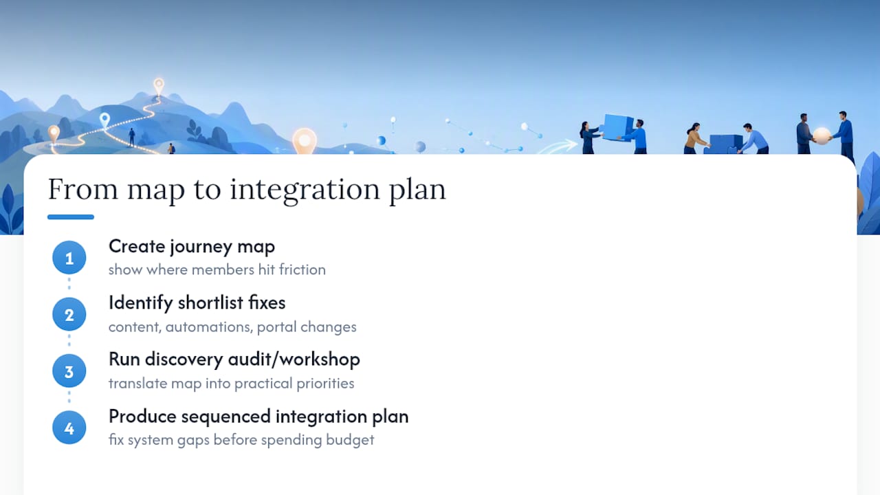
Mapping typically surfaces a similar shortlist of fixes: content that answers the question a member is actually searching for, onboarding automations that replace a manual welcome email chain, and portal adjustments that let members self-serve a renewal instead of phoning the office. Our recommended first move once a map is built is a short discovery audit or workshop that turns the map’s findings into a practical, sequenced integration plan.
Pro Tip: Before commissioning any website or CRM change, check it against your map first. It’s a fast way to avoid spending budget on a fix for a problem members never actually described.
Why the exercise matters more than the diagram
The polished map you present to the board is not where the value comes from. It comes from the argument in the workshop when the events team realises marketing has been assuming something about members that turns out to be false. That friction, uncomfortable in the room, is what actually shifts behaviour afterwards.
A good map becomes a discussion tool that produces a shared, prioritised backlog rather than a filed document nobody reopens. Keep it light, keep the backlog short and owned, and put a date in the diary to revisit it. Quarterly is a reasonable rhythm; anything less frequent risks the map going stale before it has done its job.
— Rob
Turn your journey map into a working digital roadmap
Membership organisations that map their journey usually find the same three culprits behind lost renewals: a website that buries the information members actually need, a CRM that nobody’s fully trusted to trigger the right follow-up, and a portal members avoid rather than use. Cloud 9 works specifically with established organisations to close those gaps, rather than treating website, CRM, and automation as three separate projects run by three separate suppliers.

If your map has thrown up a backlog of fixes and no clear order to tackle them, a short discovery audit is the sensible next step. We look at where your CRM and marketing automation can absorb the manual work your map exposed, and where your website needs restructuring so members stop hunting for basic answers. Get in touch to arrange a discovery conversation and leave with a sequenced plan rather than another spreadsheet of good intentions.
Sources
For deeper reading, see ASAE’s guidance on outside-in mapping, Hivebrite’s member journey glossary, and Member Lounge’s stage-by-stage template guide. For a real-world example of a mapped member pathway, see this affiliate membership programme.
- Member Journey: Definition, Examples, Benefits (Hivebrite glossary)
- Customer journey mapping: a blueprint for understanding your members’ experience (ASAE)
- How to build a member journey map for your association (Member Lounge)
- Google Analytics for non-profits (Getting Attention)
FAQ
What is journey mapping?
Journey mapping is the process of visually documenting a person’s full experience with an organisation, including every touchpoint, emotion, and decision point, rather than just the internal steps your systems record.
What are the steps to map the member journey?
The core steps are: set objectives and pick a segment, gather mixed qualitative and quantitative evidence, run a collaborative workshop to plot stages and touchpoints, annotate emotions and friction, prioritise by impact versus effort, and build a small owned backlog with a quarterly review.
What is the most popular journey mapping tool?
There is no single dominant tool; many membership organisations start with simple templates in Miro or Google Sheets, while purpose-built platforms like Hivebrite and Member Lounge support ongoing tracking once the mapping process is established.
What are the stages of a member journey?
A typical member journey moves through awareness, consideration, onboarding, engagement, renewal, and advocacy, though real members often move between these stages non-linearly rather than in a straight line.
How is a member journey map different to a CRM workflow?
A CRM workflow documents what your systems do, such as sending an automated email; a member journey map documents what the member actually experiences, including their emotions and points of friction, from an outside-in perspective.